Creative Director : : Art Director : : Designer
THE ASK
There are plenty of white label online ordering platforms out there, but LPQ was looking to create a seamless, cross-platform experience that was a true representation of their brand. And just to keep it interesting, our solution had to integrate with multiple third-party systems that handled everything from payment processing to catering orders, while also translating over 10 different languages. Oh, and be WCAG 2.0 Level AA compliant.

The original ordering experience.
LAYING THE GROUNDWORK
We began by getting a better understanding of the LPQ customers and their needs and expectations. Some are just picking up a quick bite on their morning commute, and others are ordering food for their entire office. Through multiple working sessions with the clients, we focused in on the right path and set aside other options that could be added later.


OUR PLAN
Our content strategists began diving into their current site, or sites plural, both in US and all of the international versions. We worked with the client to determine what content was helping and what was hurting their objectives, and how to focus their content on what would most benefit their customers. We listed out every possible task a user might want to complete on the site, and organized them by what systems were required and what actions belonged together. After building out key user flows, we began sketching out ideas for how to best tackle each requirement and our UX team developed wireframes of each step. A site map helped reorganize their existing content and simplify the overall navigation.
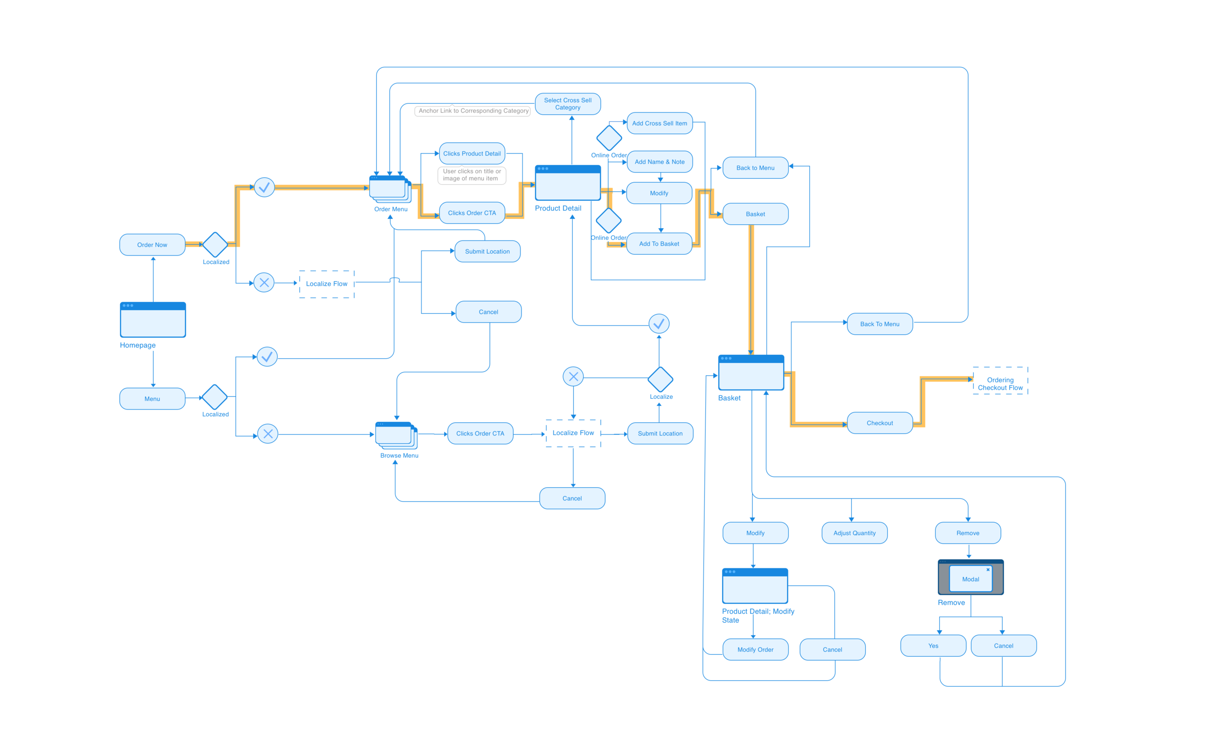
Online Ordering Flow

Various Mobile Wireframes
THE BRANDING
We began developing our design system and determine typography, brand colors, and the look and feel of our UI. Just like no two loaves of handmade bread are the same, we wanted our interface to reflect the handcrafted nature of their food while also feeling modern and easy to use. The food is beautiful, and we wanted a color palette that complimented the freshness and seasonality of their offerings. The type mixed a classic slab serif in Sentinel with a friendly sans serif typeface in Karla.
COLOR PALETTE

BUTTONS & FIELDS

TYPOGRAPHY

ICONOGRAPHY

THE EXPERIENCE
Our visual design team collaborated with the UX team to work through the different key flows of the experience, both on desktop and mobile. The site is mostly responsive, with some specific adaptive elements. One key element to the LPQ brand was making every ingredient clear, and making it easy for those with different food allergies or dietary lifestyles to easily find what they can eat. Are you gluten-free and allergic to tree nuts? We’ve got you covered. Applying a filter and flagging mechanism, users can easily seek out the food that fits their lifestyle while avoiding common allergens. Instead of having to hunt, this info is highlighted right from the menu category pages.


GCD Michael Brandt, CD John Livingston, UI Tiffany Shih, UX Molly Guyon, UX John Ruiz, CS Justin Clemens