THE ASK
They had a bold vision to reinvent the bulk shopping space and they needed a name, logo, branding, and a unique app experience to bring it to life. Make shopping via mobile easier than anyone thought possible, and don’t be afraid to disrupt the status quo. It was a great brief.
THE AUDIENCE
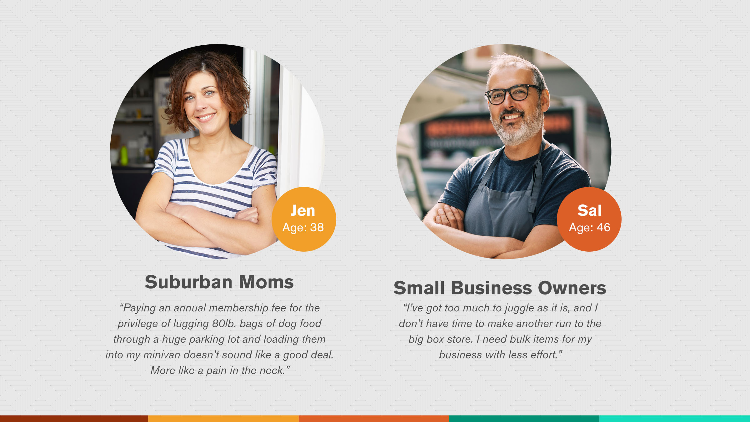
Staples knew that tech savvy suburban moms and small business owners were the most likely to embrace an app-based bulk shopping experience. Both are time sensitive, value driven, and have other people depending on them.
THE BRANDING
During our naming exercise, we came up with Klub, which is the word “bulk” backwards. And this backwards thinking sparked the attitude and features for the rest of the project. We wanted to truly turn the bulk buying process on its head. The color palette was energetic, the logo type friendly, and the tone of voice was smart and spirited. The exact opposite of the Costcos and Sam’s Clubs of the world. It was truly bulk backwards.
PRESS + SLIDE TO ORDER
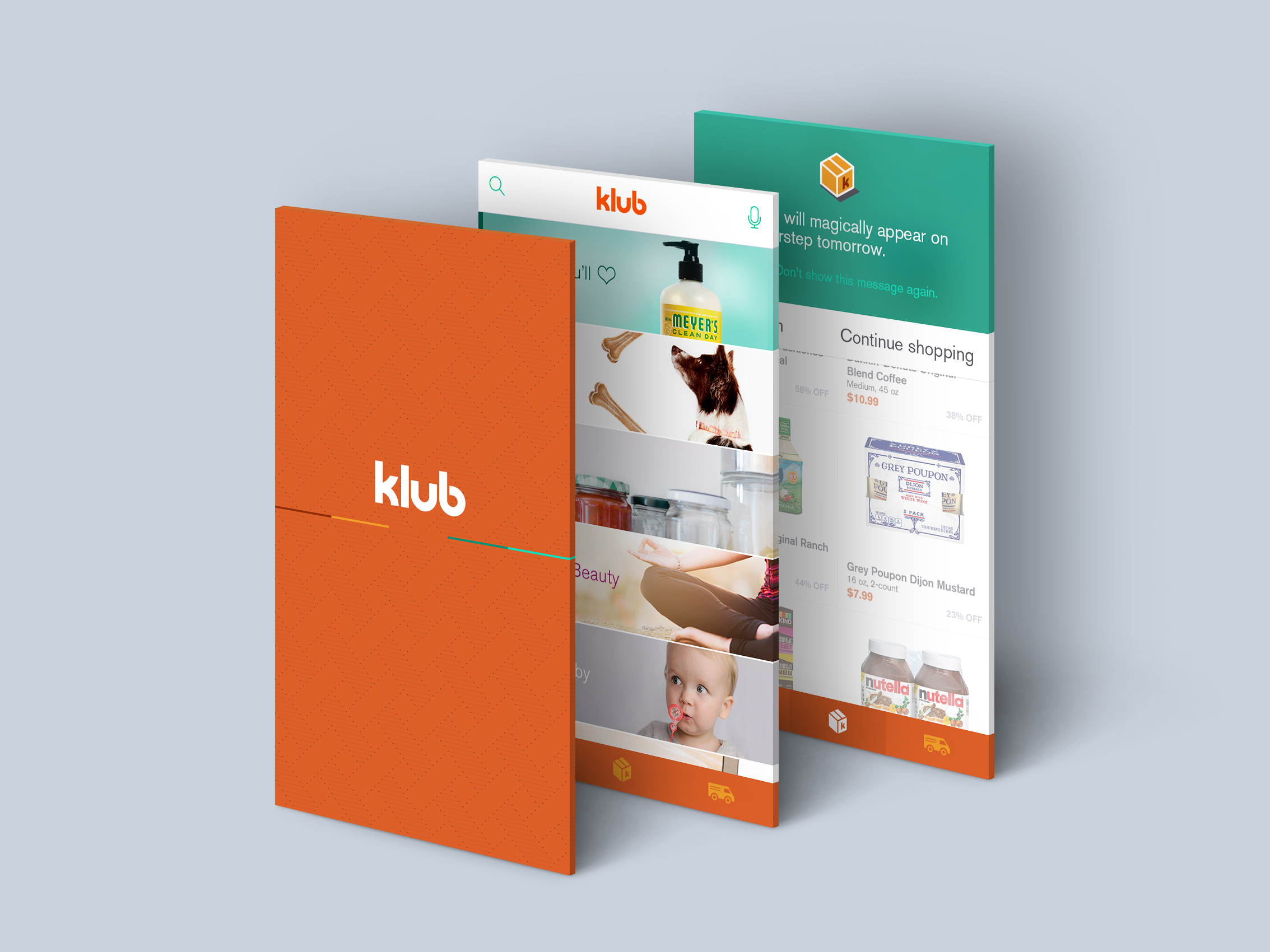
Our goal was always to see how fast and easy we could make the ordering process. We still had product detail pages if you were interested in learning more, but we also offered the ability to quickly order, schedule, or dislike an item from the category page.
ORDER FROM SEARCH
Instead of typing words into the search bar, selecting from the results, then clicking a buy button, we allowed users to buy directly from the auto-complete search results. Boom. Done.
ADIOS SHOPPING CART
One last twist to the standard ordering paradigm came from getting rid of the 2-step process of placing items in a cart and then clicking again to place the order. Since everything would be overnight shipped, anything you selected to order was automatically set to pending and would lock in at the daily shipping cut off time. Before the shipping cutoff, you could make changes but not after. A persistent countdown timer would keep you in the loop. Speed and simplicity was the order of the day.
AD John Livingston, CW Erin Schwarzbach


